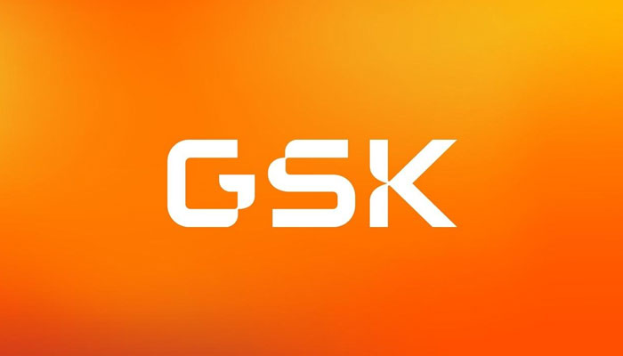
The British Big Pharma has launched an innovative rebranding, a tech-flavoured logo, and an impactful transformation for the future as GlaxoSmithKline turns GSK and eliminates its consumer unit. GSK has utilised the orange colour in its logo for a long time, and it continues to do so with the trimmed down GSK trademark, albeit in a darker shade than before. The colour scheme has also been reversed– instead of white letters on an orange background, the text is now orange with no base colour.
The GSK is now all capital and stands alone, making for a more powerful logo than the previous one, which employed lowercase text enclosed in an oval shape for a softer appeal. A GSK spokeswoman confirmed that their name and the unique colour both happen to be key parts of their identity and will remain an important part of the new brand.
According to the spokesperson, the new design was inspired by catching image found in biosciences, and it features numerous curving forms that evoke the agile and adaptable aspects of the human immune system, serving as a message of the continuous need to develop and adjust. This also reflects GSK’s research and development goals, which are focused on harnessing the body’s immune system to help develop new and better medications.
The dynamic and innovative GSK logo, housed in a revamped shape known as the signal, consistently marks the way ahead, GSK noted. The identity system flexes, adapts, and moves to engage audiences in all of the brand’s digital, social, and physical settings.
This comes as the company prepares to spin off its consumer division, Haleon, which will be the largest company to float on the London Stock Exchange in more than a decade. GSK is expected to become a slimmer, meaner R & D engine as the demerger process gets going in the coming weeks, and the shift in branding and logos reflects this broader change within the company.
Following the demerger, GSK will be entirely focused on biopharmaceutical innovation, with a new purpose to bring science, technology, and talent together to move ahead of disease, the drugmaker added. This new purpose and expansion objectives are reflected in their branding. It draws together science, technology, and skills while also conserving vital aspects of history. The redesign comes a month after GlaxoSmithKline dropped GlaxoSmithKline as its official name in favour of GSK. These changes mark the end of a 20-year trademark that began with the merger of Glaxo Wellcome and SmithKline Beecham to form GlaxoSmithKline at the turn of the millennium.
The drugmaker still wants its history to be a part of the company, but the new logo reflects its desire for collaborative partnerships. This will extend to how the new GSK communicates with the media, with a focus on straightforward language. Sanofi, a French pharmaceutical company, made a similar switch at the start of the year, dropping the Pasteur and Genzyme names and rebranding as just Sanofi. With the switch came a new, streamlined logo that included a homage to the tech sector.


